Hii Magazine, which was launched by audio professionals aiming to connect a global community, elevate sound as art, emphasize the importance of listening, and make concepts of audio accessible, wanted to create a destination for sound culture and the listening-obsessed. School designed and built a visual identity system and editorial platform for sound culture and the listening-obsessed.
The Hii Mag logo can be arranged in many different ways. Each color block corresponds to an individual sound file, which when combined make-up a unique compound sound. Unlike many generative identity systems that are constantly changing, we think about the Hii Mag identity system as “fixed dynamic."
The desktop and mobile interface for the website is meant to serve as a listening interface first and foremost allowing the design to take cues from music interfaces that most of us interact with on a daily basis.
The desktop and mobile interface for the website is meant to serve as a listening interface first and foremost allowing the design to take cues from music interfaces that most of us interact with on a daily basis.
Article pages – hii-mag.com (desktop)
We designed the micro-interactions on the site to have a tactile feel, complete with sound effects designed by Hii, as an homage to sound equipment that clicked and popped and plugged.
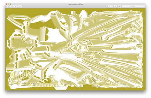
School developed a bespoke typeface for Hii Magazine called DAWs based on digital audio workstation (DAW) interface, which also influenced the Hii Magazine logo and overall identity system.
Search functionality on hii-mag.com


